Thursday, January 31, 2013

More teeth!

More teeth... these ones I found online for cheap.

I will begin working with them over the weekend, and will have some more to show on Tuesday.

See you all then!


42nd Day of Winter


I've had an interesting development. I've taken the processing sketch "121118e" and taken screen captures and converted them into a rough pixel vector. Then I turned the vectors into the pure CMY colors and overlapped the three layers in InDesign. To bring it to a final piece, I would want to remove the rough pixelated sides of the triangles.

Space


I can explain... But I wanted to experiment with my idea 3 dimensionally. Im trying to deal with negative space as a physical entity. I think that I may continue experimenting with this idea but I also have a idea where I might be able to bring back some paper marbling. 

Wednesday, January 30, 2013

Repeating. And Second Guessing.


Working with color, line weight and outine vs. solid shapes here. Although I feel like I can't get caught up in this yet, it was good to explore for now. After this I'm going to focus more on just cleaning up the patterns I've designed and repeating them ---- and then decide on color/line weight/solid vs outline. I also think I can't overwhelm myself with the possibilities of all the combinations of how to present the patterns (color combinations, line weights etc). As far as producing yards of textiles in final production it will be a sample of color combinations and line weights a consumer may choose. The catalogue be the place I will present the different variations of the patterns (outline vs. solid), and then color selection will come from the color chart. That's how I see it panning out in my head, and how I want to structure this line.


And about the logo I've been working on "One Afternoon"... in Design Stories we are studying where typography began and really made me think about doing something like the 'clean' typography that Bodoni did before the 19th century when things got commercial, flashy and complicated... Is the handwritten idea overdone? Or is it okay and comfortable with what I'm designing/doing? I know it relates well, but should I do something contrasting in the opposite direction? Opinions? I may reject this whole idea in a few days when I see it and mull it over, but I couldn't ignore the idea and had to try it out.


Interesting interactive sound/image project

Here's some stuff I've been checking out since we talked about the potential for making an interactive installation on Tuesday.

Blair Neal's device

Blair Neal made a device that uses a projector wired to a computer to sense drawings (on projector sheets) as they pass over a sensor. The computer turns them into whatever sounds have been assigned to different colors/positions on the paper.

He gave his code to someone else who made their own version of his machine that works with normal paper. He uses mostly prints/illustrations to trigger the sounds rather than dots and lines like in Blair's.


This is the next page of the manual I've been working on to help show the relationship between sound and light wave frequencies. It needs more work - I should have started from E so infrared and ultraviolet would be at the ends of the spectrum rather than overlapping:


Map


In addition to cleaning up the type and aligning numbers I started working on the map. I dont want to add much more information to the map besides marking each mountain featured in the book and incorporating a compass rose design I made. This way readers can see where each mountain/slide is in relationship to the others.

"Found" Some Teeth!


I got some teeth! Something to actually start working with.

I have more (3 full sets, 80+ acrylic teeth) coming in the mail as well.

Freaked out yet?

Tuesday, January 29, 2013

Sonochromatic scale, chord triads

Here are a few pages of my music/color manual, modeled off of Neil Harbisson's Sonochromatic Scale.

12 Note scale represented in corresponding colors, showing lighter/darker versions meant to represent higher/lower octaves.

Visual representations of notes combining to make all basic major/minor chords. The most basic chords are made up of triads - three notes combined to make one harmonious chord.


Announcing My Entrance To The Blog...

Okay, I'm here. 

I will post something sometime today. Until then, should you want to review my older progress until now, see my tumblr.

:D

Monday, January 28, 2013

Repeated Pattern


TEETH!

Researching Teeth in Dreams: Theories on Meaning-
  • loss of power or control
  • castration anxiety (Freud)
  • misfortune
  • wishing to be punished, masochism
  • warfare (Chinese)
  • death of an aspect of a person's psychology
  • "losing face" or loss of identity
  • fear of ugliness or becoming old and/or unattractive
--
What is apparent in MY tooth-related dreams?
  1. DREAM 97: dislocated jaw, too much pressure on teeth, tooth caving under pressure
  2. DREAM 120: all teeth become loose, they all fall out, try to push them back into sockets (biting/bearing down on them to do so), holding my teeth in my hands
  3. DREAM 205: feel that molars are too big, closing my mouth crushes them, they fall out onto my palm, bloody paper towels
  4. DREAM 210: back left molar falls out, lots of blood, then front teeth fall out, a nerve strand hangs from socket, it is pulled (very painful)
  5. UNKNOWN (not documented in journals) DREAM 1: teeth fall out, put back into sockets backwards (roots out)
  6. UNKNOWN DREAM 2: teeth crumble in mouth, spitting out little pieces
Notable Commonalities-
  • teeth being too big/ not fitting/ under pressure
  • teeth in my hands
  • blood/pain

A quick sketch that I have rattling around in my head for my first piece... a package design for "Sweet Dreams".


Thought process...

Since I've changed my topic, I've been spending a lot of time brain storming and doing the initial research to come up with a set plan. My first step was to take all of the letters I had and copy/scan them so that I had versions to write my thoughts all over and be able to reproduce more to mark up. (which took so long!) Then, I started going through the letters and taking out quotes from each letter that summed it up. I wrote them on flashcards so that it was easier for me to sort through them and stay organized, and I ended up realizing that most of the letters themes are to focus on the journey not the destination and to live in the moment.


The quotes that I decided express that are:

"Enjoy where you are, where you are going and the journey in between"

"Focus on the journey, not the destination. Joy is found not in finishing an activity but in doing it." -Greg Anderson

"Take time to enjoy whatever moment you are in before moving on to the next one!"

"So, know that at any point where Yin - dark, down, perhaps sad - may be winning out, very soon thereafter Yang - bright, up, happy - will shift and displace Yin. Trust that it will, look for it to arrive and welcome it when it does! Be aware of - and as importantly learn from - the contrasting experiences!"

"I am left to conclude that sometimes joy is found in the journey itself and not the destination." (a re-quote from my dad of the Greg Anderson quote he used)

"Every moment in the here and now is a future memory so cherish the moment!"

"What matters is to live in the present, live now, for every moment is now. It is your thoughts and acts of the moment that create your future. The outline of your future path already exists, for you created it's pattern by your past." - Sai Baba

"I am encouraging you to not limit yourself to self perceived boundaries, to be aware of the journeys or enlightenment ahead of you and learn all that you can from them."

"It just seems that, like the waves in the ocean, the future keeps lapping at our feet and receding to make way for the next wave. I think every so often we need to look up from enjoying the waves and appreciate the beauty and magnificence of the ocean and sky and sand and sun and person sitting next to us"

"So, while I believe it is important to stop and smell the roses [or insert your favorite flower here] I think it is at least important, and perhaps more so, to stop and listen..."

"Or, maybe the thrill of the ride and uncertainty of where you will bounce next is an experience beyond belief."

After I decided what the over all theme I want to focus on is, I spent some time seeing what days the letters were written (28 on Fridays, 7 on Thursdays, 1 on a Monday, and 1 on a Tuesday) and then I took those dates and used my old calendars/daily planners to figure out where I was on those days while my dad was writing the letters to me. I'm not really sure what (or if) I'm going to use any of that information, but it was a good exercise to record all the information and let my brain try to put pieces together.

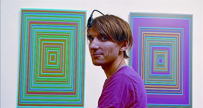
Other than all of the documenting/organizing I've been doing with the information, I've mostly been brainstorming. I came across an image of the inauguration ball:


and that got me thinking about how living in the moment and fully experiencing the journey is often tainted by the over abundance of technology. I haven't figured out exactly how I want to incorporate that, but I thought it was interesting.

I still want to make some sort of book, mostly because I haven't come up with how to execute my ideas so I thought that starting a book would give me something to do and help my ideas flow. I was thinking of taking the letters and emphasizing the quotes that I've already taken from them along with possibly depicting what I was doing or what was going on in my life and the world when they were sent to me so that the whole book would show my journey through college. As of now the piece would just be a way that people could better see and understand how my idea came about. But, as usual, I'm still not sure.

After all this I feel like I'm finally starting to get a topic and slowly discovering a direction to go that I'll be passionate about. 

Page Layouts


I first decided what pages from the original book were redundant and deleted them. I brought the remaining 30 pages into photoshop, clone stamped out any pre-existing type, cropped out any instances where the photographer left the airplane in the picture frame, and resized each file to 9'' x 7''. I then brought the files from photoshop to indesign whereupon I added my own type and renumbered the slides.

Thursday, January 24, 2013

Diving Deeper into Dream Themes

Hi class.

I have updated the "Dream Survey Results" post with actual numbers of votes for each theme. The actual count from my journal is yet to come as I need a bit more time to paw through all 220+ of them! You can visit the updated survey post here.

In the mean time I have purchased a rather interesting book about dreams titled "Get a Grip on Dreams". I have been looking through it and making note of interesting facts about dreams (and the common themes that fill them) that might be of use to me for my project.

I am also starting to mentally plan out my first physical piece. With the help of these I'm hoping to create a really visceral and eerie piece about the common "losing my teeth" dream. It may not have been the most popular theme, but I do feel that it is one that I can evoke a strong reaction to in a successful way.

That's all for now.

Dana

Wednesday, January 23, 2013

blueprints

For my next phase of exploration I want to experiment with my photographs by creating cyanotypes. I posted some older cyanotypes from my earlier series on my flickr account and will be making newer ones from my more recent photographs over the weekend (hopefully its nice and sunny!).

These are a few sample pictures from my earlier series:


By creating these cyanotype prints I hope to be able to loosen the photographic form (without jumping into cutting up and dissecting the images quite yet).

 In my newer series I want to really focus on exposing the negative space through this print process and experiment more with the repetition of images as seen above. 

Book Content


Appropriating scans in photoshop. Cropping, re-numbering information, and applying posterization filter. Next I take the .psd files to inDesign for layout. 

Scanned and Vectorized.


The next step, but not done of course.

Tuesday, January 22, 2013

Monday, January 21, 2013

A name!

I focused last semester all on designing patterns and colors for my project. However the whole time keeping in mind how everything will tie together in the end... meaning the textile patterns, colors, name, branding, etc. I've finally come up with a name that I feel relates to the inspiration and story of what I am designing: One Afternoon. I started loosely sketching the name (in a large sketchbook....!) with some thought as to how it may look. I'm still deciding between script or tall caps. Either way I want it to feel hand written but clean.

My plan is to work on this branding element simultaneously with refining my textile designs and color line to off set production time. I also really needed to start this part of my project to get it out there and the wheels turning.


Photographs and Documentation

I've been trying to finish up organizing my photographs and making them available online by creating a Flickr account. The account address is  http://www.flickr.com/photos/urbanscreen2013/     However, I am not sure if the security settings allow people to view my posts yet (a issue I may need help solving).

A sampling of what is up on flickr:


I also started looking at POTENTIAL sources of color in my source material:
Sample of color source material also found on flickr:


Media/Brands

I've been paying extra close attention to commercials and looking at the subconscious elements that brands use to sell more of their product. The 2013 Toyota Avalon commercial is one that really caught my eye. My notes of what happens in the commercial followed by my evaluation of the commercial is as follows:

The commercial starts off with some type of faucet/sink/spout that drips a black substance (one can assume it's ink) into a large body of water. The ink swirls and moves gracefully (all while graceful, calm music plays). The ink blots form Rorschach tests (leaving the viewer to interpret images on their own). The ink then drips down and slowly forms into the car...from top to bottom. A soothing man's voice then says "let's take every drop of courage. every ounce of inspiration. every bit of determination. and go where we've never gone before." The music then starts to speed up while the water in the "tank" drains and everything seems to get more intense. This is all happening in a blank, concrete room and there's not much detail in the background or the floor. There are close up shots of the car, and the headlight goes on. The shots are really intense. After some close ups of the car and the water drains, the car drives away towards a random beam of light. The commercial then zooms out to a picture of the car driving, which is surrounded by other photos of wholesome things (such as a girls soccer team, a happy family, etc). The photos morph into a globe shape and then transform into the toyota logo. "Toyota, let's go places"

The whole commercial sets the mood from the very beginning. They play calming music that then turns intense and "cool" to emphasize the feeling that they want the car to give off. The commercial in itself oozes "cool" and hints that if you get this car you will be "the coolest person ever." There are barely any references to the car itself. There are also no references to pros and cons of buying the car. All the audience gets from the viewing is that they will be cool if they buy this car.

Sunday, January 20, 2013

Music as design, design as music

I'll be posting some links to things that I've been watching / listening to in my research. This is a really interesting Ted talk with an artist named Neil Harbisson who was born completely colorblind. At an early age he developed a sensor that turns whatever he's looking at into sound. It changed the way he looks at the world, and has been working in reverse ever since he became familiarized with the connection. It's about 10 minutes long, definitely worth the watch if you have time.

Ted Talk: Neil Harbisson

Neil Harbisson on Wikipedia


Saturday, January 19, 2013

Mock-ups

Drawing maps, sewing booklets, and scanning images.

Friday, January 18, 2013

Dream Survey Results

Now that I have nearly all of the surveys back, I have a pretty clear image of what we dream about as a class. Thank you all for your timely responses!

Here are the results of the survey:

Themes in order of most to least popular (multiple topics under the same bullet received equal amounts of votes, crossed out type received no votes). Updated on January 24th with number of votes!)
  • Being chased/chasing someone 9
  • Being physically attacked 8
  • Famous people, Flying, Falling, Sex (positive experience) 7
  • Dead loved ones, dying or being dead yourself 5
  • Losing your teeth, Swimming/Water, Being lost 4
  • Modes of transportation 3
  • Taking an exam/test, Sex (negative experience) 2
  • Public Nakedness, Giving birth, Machines failing you 1
  • Changing sex/ being the opposite gender, Needing to use the bathroom 0
I enjoyed your responses of additional themes (all of which are also in my dream journal):
  • Tornadoes
  • Borrowing/Stealing
  • Being ignored/Not being heard
  • Books
  • Pregnancy
  • Working
  • Aliens
  • War
  • Survival in a post-apocalyptic world
 Something I am thinking about: With the exception of positive dreams about sex, we as a class mostly dream about negative themes.

Thursday, January 17, 2013

Process/JMT U&I Daily Dropcap

Cyrillic Letter burned using Scripto Lighter
Finger covered in ash


Idea for today's daily dropcap: Create a cyrillic letterform using burn patterns.

Background: Humanities discussion about Russian Poetry, and the spread of poems through recitation and burning. Dropcap will be burned.


Likes: impermenance, pain, suffering, alternate letterforms, emotionalism, physical harm, historical context

Obstacles: Poor lighting, poor lighter, pain, poor technology to document (video cut short)

Notes: Paper is burned very easily as a single sheet. Burn patterns are harder to make and thus more controlled when paper is stacked together. Air becomes important, because airflow determines burn pattern. Paper orientation can be manipulated. Angles of lighter stay constant, everything else moves. Silent process.