Wednesday, March 27, 2013

Finalized show cards

I played around with my card design for a while and decided not to change it too much. I'm happy with the little changes made. I've been super busy lately, and should have some more time to work on the programming this weekend.


Vistaprint teases you:


Paper & Print

A few days ago, I ordered 100 sheets of text weight tabloid extra paper in two different colors from French paper. I am praying that it they will be like the paper I imagined using as I dont have swatch books to order from... I did successfully have some sent to me now, before they were for a fee, this time they were free so I went for it!

In the mean time I am editing my scans and would like to start printing (after class if possible or arrange a time that would be suitable to at least test the quality of the print and the paper its printed on! Also of course to really SEE the scale at which I'm envisioning my work. It will be nice to actually see.

Thats that.

*updated

I spent some time researching sociology since everything I've done so far has had something to do with that... and while still focusing on habits I started thinking about how sociology, psychology and graphic design are all related because sociology is study of how humans interact with their environment, psychology is the study of the human mind and understanding why/how it works, and graphic design helps create things that appeal to the senses and sometimes uses psychology and sociology to produce better pieces.
I made a new piece reflecting on my habit of wanting to use my right hand... it's an image of my bones/muscles/tendons with numbers of how many times I wanted to use each section of my hand/wrist. 
I printed it on acetate because the image comes out better like that... and then accidentally also printed my other abstracted graphs on acetate and layered them... and focusing on psychology I made some ink blots and then turned one into an inkblot made out of words with words that I found in a list of the top 10 most common emotions.


I'm also thinking of maybe looking at the idea of somewhat specific habits that most people share. Starting with the habit of people categorizing. Generally, everything we come in contact has to be 
categorized ..even if it's as basic as safety or danger. I started playing around a little with photographs I have to try to find a gray area where people encounter something they can't define and therefore it becomes an uneasy experience because their usual cue for the habit is something that doesn't have a normal routine or reward because it's difficult to define.
I didn't have time to shoot new photos so i made some very rough sketches and I plan on taking photos asap


Printed, pressed, cut, sewed.

Made three out of ten of my Indian books.

Tuesday, March 26, 2013

stamp and work

I ordered a stamp (to use with my business card and postcard). not quite sure if im going to use it or not but I figured I should order it now so that I get it back in time. I choose blue ink for now but i can always choose different colors and pick them up at acmoore or staples. 


(drawings / models to come)


Monday, March 25, 2013

Photographs, Catalogue and Other Things.


After much consideration I've chosen these four photos to be the ones to display at the show to represent where the colors and patterns derived from. Since everything really did source from photographs I took, these are really important to include in the display. Originally I was going to do them all in color, but after thinking it over for a bit I decided it would look best and portray them best if the ones showing the form/line that informed the patterns to be in black and white and those that inspired color be in color. It makes much more sense to me this way and will look better a set, and less confusing as to what relates to what. I purchased four white frames to hang them in. I went against the idea of the weather wood, worrying that they would take away from the photographs themselves. I've also begun the hunt for some sort of furniture or fixture to display the fabric with. My show cards have come in and have been mailed to family and some professional connections. All the yardage of textiles have been ordered and should be in by the end of this week. The only thing left to design is the catalogue which I would like to have a lot of photography as well as text and an emphasis to 'tell my story'. The biggest idea I have for that is to photograph the textiles in the environment form which they were inspired. I feel like I have all my ducks in a row, I just need to produce the things that are left! And once the fabric comes in, I'll be able to make more headway on the packaging as well as the catalogue. As far as the exhibition, I've been thinking more about the space itself - trying to imagine it without knowing what I'll be working with yet. And I have come up with ideas such as painting the wall space I have (hopefully a corner created by a partition wall near the window?) with one of the neutral colors from my line, and how to cut the drift wood to be flush with the wall -- pain a portion of that as well...?


I could refinish these to be white or with a faux weathered look that I've done on other furniture like this: 

Here are the four white frames:


Inspiration for the catalogue:


Inspiration for the gallery:


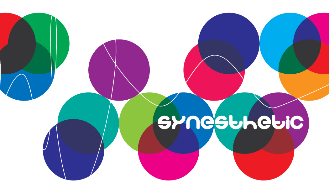
Here is a very rough layout for the catalogue. Also, I've switched gears with the logo. After stepping away for a few weeks and now coming back to it and applying the logo on something polished like the catalogue cover (vs. the rough materials of the packaging --- the polished making me think how it needs to look on other documents like a business card, letter head, etc..), it didn't feel right. It didn't feel like it was communicating what I wanted it to anymore. I love it, and spent so much time on it, and I'm not scrapping it forever (I think it'd be great for a line targeting a younger audience), but for this line I need something more polished and sturdy. I'm going with it because the relief I felt when I came up with something new was enough to give me the answer that it's right.

Logo: code light and quaver sans


Friday, March 22, 2013

My First Exibition / And a Website!


So, I've been incredibly busy preparing for my illustration show (I hope you call can stop by and see it!).

Admittedly, this means that some of my design work has been put on hold... especially because it will not be showing until next semester.

However, I have decided that I want to create a website that encompasses both the illustration and design part of my project. I have found a little time to start working on it. That is what the screen-caps are (above). This will be a way for me to organize my thoughts, as well as a way for me to better publicize and market the work as an overarching whole.

I am currently in Web Authoring I, so my HTML and CSS skills are still limited. I am using a template at the moment, but as I learn more I plan to go into the code and alter the design.

Thursday, March 21, 2013

New Word Collages, Scans, & Postcard.

I, your, we collages. I decided I was unhappy with my previous collages with the exaggerated larger type so I made the new ones more consistent in size and quality of stroke. I also chose to do this to achieve the blending of colors more and also to embrace the lack of space covered as well, this goes along with my ideas of memory being used for planning the future not as libraries of the past so white space signifies sections of less important information to the future.... I have scanned this is as 8x10.66666 at 1,600dpi which I will be preparing for print within the next week! (I hope!) at least a single prototype.

I have also been thinking about our post card for our show... This is the direction I'm thinking... It connects to print, design, conjuring ideas, music, rhythm, and I think it describes our journey through seminar slow but then work began popping up exponentially an with more fervor than previous. :) subconsciousxxx.tumblr.com/image/45738693702


Wednesday, March 20, 2013

Loop machine controls, show card

I did some work routing the controls of one of the Wiimotes to the first four loop control modules in my sampler in Max. It's a little confusing but coming along. I figured out how to add a master volume control that can still allow individual volumes to be manipulated using the Wiimote.


I'm experimenting with using the XYZ inputs to control things like volume and loop speed by holding a button and making a gesture. I also figured out how to encapsulate patchers (shown below) in order to avoid a huge mess of patch cords and obscure programming commands. Any box that starts with "p" is an encapsulated patcher - you have to open it to see its contents.


I worked on my card designs for a while. I think the back needs to be revisited, and have some ideas for adding a few more lines to the front.


Final Yards.


Here are the final designs. Colors have changed a bit and I slimmed down to eight. These are off to be produced at Spoonflower. I ordered 1 yard of each in a normal weight cotton, 1 yard of a pattern in an organic cotton knit for a scarf, and 3 yards in a heavy twill cotton to make pillows and cover a chair seat. They will ship in 8-9 business days. Once they come in I will make my decisions about the packaging and tags - so I can use my materials on the actual textiles. Until then I am going to work on producing the catalogue.